World Bank Case Study
World Bank Case Study:
Effects of Education on Economic Outcomes
Research Question: Can selected educational indicators be shown to correlate to economic growth?
I sought to determine whether any of the variables selected (listed in Table 1 below) explain or show relationship to growth outcomes for selected countries, such as GDP Per Capita. In my analysis, I looked for any correlation in the Government Expenditure, Internet Users per 100, or Enrollment in Upper Secondary variables. With AI becoming a dominant force in most sectors of developed economies, including public and higher education, countries with stronger indicators in public education may prove to have better outcomes economically.
Selection and Preparation of Data
Using SQL I finished cleaning the data, set the column types and standardized the float for applicable columns. I ensured that there were no duplicate entries, and all empty fields showed null. Most columns with null data are secondarily important to my questions, so those records were left as-is. I then exported the cleaned file to CSV again, and uploaded it to R for analysis. The dataset can be found here.
Analysis
I verified data types for each column and previewed the data, shown in Table 2. I chose to assign vectors to each column in order to create a correlation table (shown in Table 1).
y1 (Enrolment in upper secondary education) to x8 (Population, total): 0.995
x4 (GDP per capita (current US$)) to x6 (Internet users (per 100 people)): 0.749
y2 (Unemployment, total (% of total labor force)) was not closely correlated to any of the variables selected. Its greatest correlation coefficient at r = -0.189 is with GDP per capita.
To explore further relationship between GDP per capita and Internet users, I created a new column calculating their ratio. I then ran a linear regression (model1), selecting GDP per capita as the dependent variable; I used the inverse as model2. These models give a p-value of 2.2x10⁻¹⁶. Variance of 0.561 in both explains more than half the variation in GDP per capita alone--though with the caveat of a substantial error size. It may be a meaningful relationship, but there is of course much left unexplained.
All coding for this R analysis can be found on my RPubs page.
Visualization
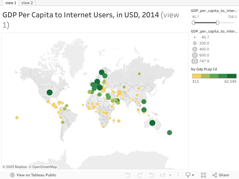
The visualization I chose, at the top of this article, utilizes one of my favorite views. A circle view, with size and color of each circle representing data, give a very visual sense of how countries differ. At a glance, it is easy to identify areas of the world with the highest GDP values (by color) and ratio of GDP to number of internet users (by size). Of the sample set of countries represented in this study, the western world and the OPEC countries can be easily spotted as having the highest GDPs. In this study, the circle view allows for a visually engaging representation of the data as well as more meaningful information.
For view 1 (shown above) I selected my ratio variable, GDP_to_InternetUsers, to represent with circles sized proportionally. I used GDP per capita, shown here by its indicator code 'NY_GDP_PCAP_CD', for color distribution; the darker the color, the higher the GDP Per Capita. I also included Internet users ('IT_NET_USER_P2') in the detail level, shown when a country is hovered over, as below.

The GDP_to_InternetUsers column had values from $46 (Kyrgyz Republic) to $1343 (Macao SAR, China). I found, however, that the resulting visualization had very little variation in color, with a tiny group of dark green dots in a sea of gold. To enhance the visual quality of this representation, I edited the filter for this variable to narrow the range to have a top value of $748. This removed the points for four countries and maintained 100. The four excluded records (Macau, Norway, Switzerland and Qatar) are still in the dataset, just not the viz.
Finally, I've included a more standard representation in which the borders of each country are filled by the color representing GDP_to_InternetUsers. This is a more standard visualization but it displays only the one variable. This may be valuable for a single-purpose illustration but it lacks the complexity and interest of view 1. It is previewed below, and is available as view 2 in my Tableau Public portfolio.

Conclusions and Further Analysis
This relationship, between the GDP per capita and the internet users per 100 people, is only possibly significant, but it may have implications for the success of countries measured here. With the growth and dominance of AI modeling in all sectors of the economy, the gap between the world’s richest and poorest countries will continue to widen. In this sample, no educational factor, from primary enrollment to upper secondary enrollment and completion, showed as strong a correlation in this sample on unemployment or GDP as does the rate of internet users per 100.

